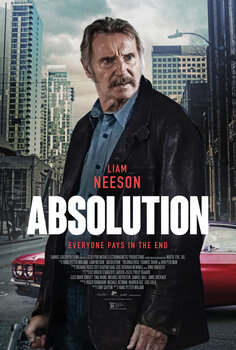
What is wrong with Liam Neeson in this poster? Is it supposed to be a grainy 70s style photograph of him or is it a drawing? It kind of looks like a combination of the two. And what is up with his expression? In the movie his character appears to suffer from memory issues so it may make sense. But with no such context given with the poster, it just makes him seem inexplicably baffled as to why he is even on the poster.
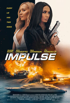
This design's main sin is trying to combine the action elements of a jet, a sports car, and a giant yacht. By merging them all together it looks as if we are about to have a highly improbable accident about to happen between the three vehicles.
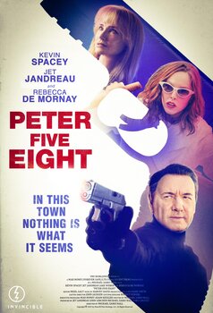
A plastic-looking Kevin Spacey appears to have a strange black blob instead of a hand that is enveloping a gun. With a gun already in the foreground, what is the point of the second gun shape in the background? Surely they could've found a better way of highlighting the actresses.
The concept of showing classmates literally caught up in the main character's experiments may have been a good idea in theory. But in reality this design is just painfully bad with its poorly Photoshopped characters placed in highly unrealistic beakers.
Internet Movie Poster Awards - One of the largest collections of movie poster images online. Additional movie data provided by TMDb. Web hosting by Pair.com